Brand management for a salon in the heart of the Arts district of Charlotte
Orange Olive Hair Gallery was a salon located in the NoDa area of Charlotte, which is the unofficial arts district of the city. As a musician, I spent a lot of time in NoDa, either to perform or to listen to other independent artists who played one of several listening rooms in the area. One of my more eclectic gigs took place at a hair salon during a monthly Gallery Crawl night, and it led to a long-lasting brnd management relationship with the salon's leadership.
When I first met with Melissa, the owner of Orange Olive Hair Gallery, she already had a logo and website in place, with established brand colors and typefaces. The website was on trend when it was designed, but some changes to web standards were on the horizon, and they would require a brand new website to stay current.
The brand had a commanding tagline: Where classic and creative collide.
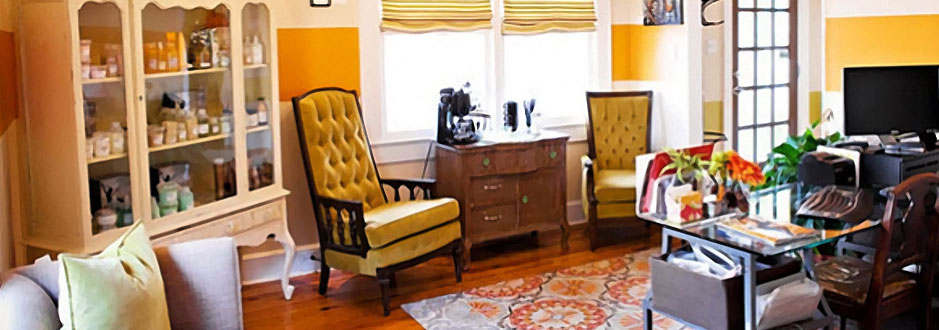
The physical location was a renovated craftsman-style house in the NoDa distrcit of Charlotte, which is known for it's bohemian style, rich music scene, and strong support of the arts.
The Gallery: When in Noda…
Twice a month, the NoDa community coordinated gallery crawls. Orange Olive transformed from salon to art gallery by hosting an open house during the gallery crawl to promote the work of a local artist. Wine, food, and live music were also key features of each open house.
The salon displayed the work of the artist on the walls of the salon to support the arts while keeping the interior of the space fresh, with new artwork for clientele to enjoy with each visit to the salon. On Gallery Crawl nights, an open house was held to celebrate the work of the featured artist and showcase the talents a local musician.
The salon needed promotional items that showed off the creativity of the business
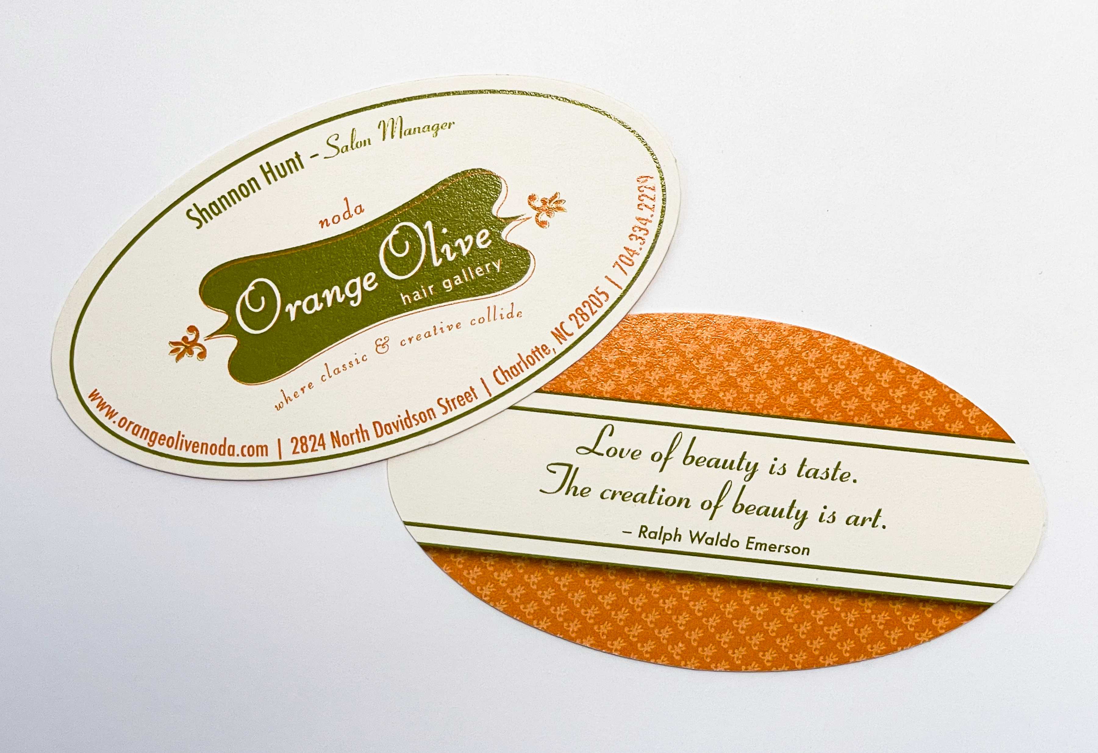
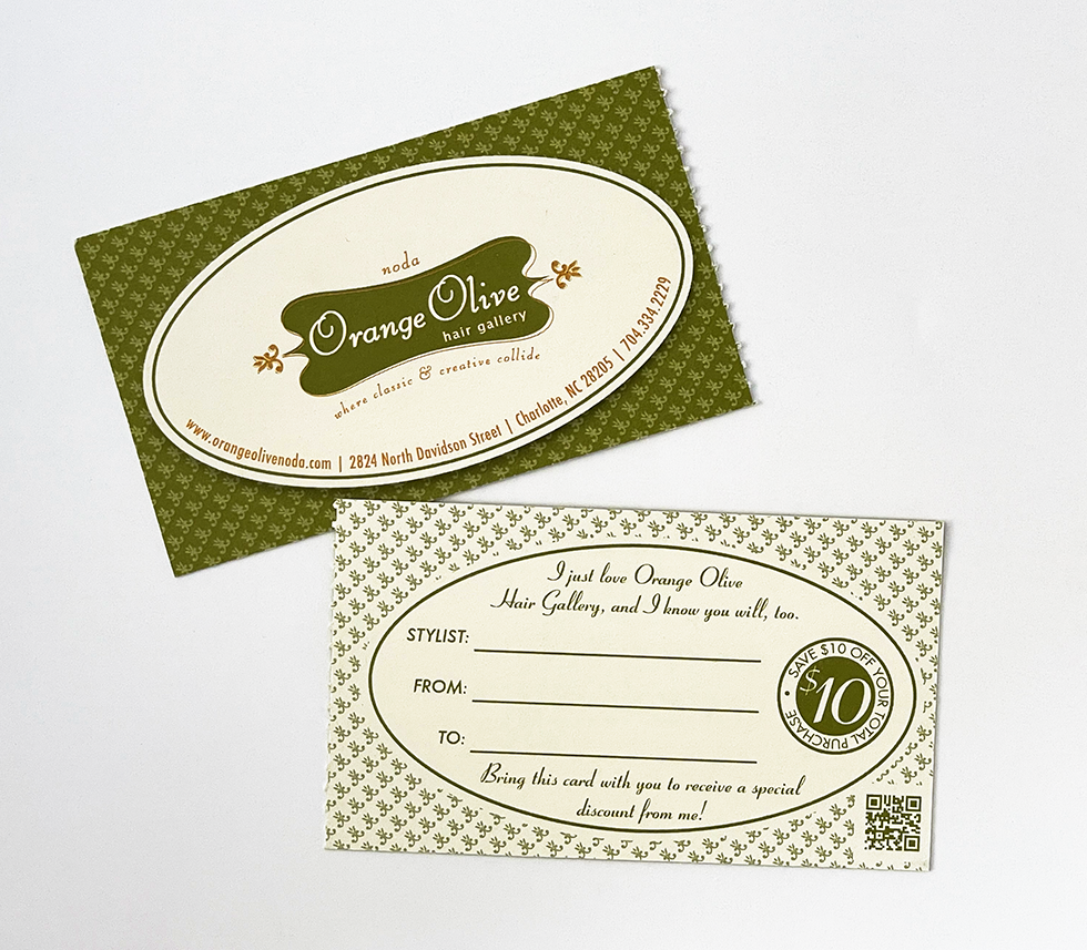
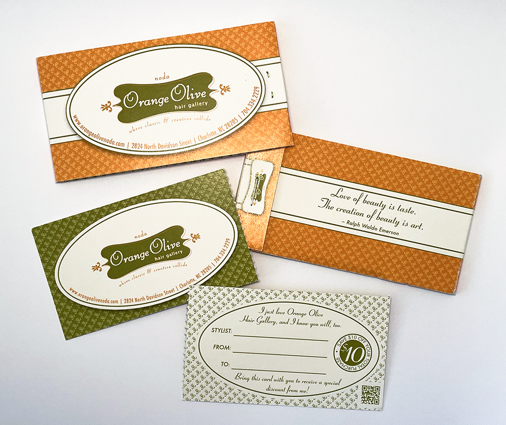
I worked with Orange Olive for many years to help create promotional items and identity pieces that captured the same classic and creative vibe that the salon and the stylists brought to work every day.
- Next came postcards that could be mailed out periodically to regain the attention of clients.
- To promote each open house, handbills with all the details were created to be handed out at the salon and sent out in the mail as postcards.
- One of the most effective pieces was a matchbook style set of referral cards that clients could give to friends and family to earn a monetary reward for both the referrer and the referee. This concept won awards Graphic Design USA and the Hermes Awards for packaging design.
- The original website was a slick Flash animation, and while it was trendy and sleek, Flash was set to be deprecated on mobile devices, which opened the door for a mobile first, responsive website, that would be easier to update and maintain. I became the webmaster for the site through several iterations, including an upfit from static HTML and CSS to a PHP/MySQL content management system called Perch. Adding analytics to the site helped to identify user flows and needs, which led to an increased use of the site and online bookings, as well.
The brand direction was set, and the concept encouraged unique solutions.
I had the pleasure of working with Jimmy to create a complete brand experience and strategy for The Rusty Onion that centered around the theme of being anything but typical.
Project Elements
Do you need a designer who can help you manage your brand on a tight budget?
I'd love to chat about your project needs. Want to see more work like this? Let me tell you about the work I did to brand The Rusty Onion, a restaurant with a name so unique that it screamed for a concept as original as the name was bold.